Welcome to my graphic design portfolio.
Welcome to my graphic design portfolio.
As the Junior Graphic Designer for Buck Consultants, I was part of the marketing team and developed a wide variety of material.
Responsibilities included creating print and web advertisements, e-mail and web banners, flash banners and e-cards, brochures, white papers, case studies, and sell sheet layouts, installation banners, iconography and infographic design. I was also responsible for photographing and photoshopping employee photos for publication use.
While working at Starbucks Coffee®, I was commissioned to create a photographic employee biography of all the baristas in the store. Its intention was to create a more personal atmosphere with the numerous regular customers in the store.
Instead of just any old tidbits of information for the individual biographies, I asked the baristas to give me information that would serve as great conversation starters for any customer who reads it. This included their favourite drink, movies, music, fun facts, nicknames and so on.
On top of placing the information over each photo, I also showed how their favourite drinks were marked on the cups as little tool to teach customers how to read them. This would help prevent customers from taking the wrong drink.
Ice River Springs had a new line of carbonated water that needed a complete branding treatment. Nicknamed Ice River Green Sparkling, the brand focused on bubble graphics, using them to also express the different flavours in sell sheets, packaging, and vehicle graphics. As an agency graphic designer, I worked on a huge number of deliverables, including branding and packaging for two different bottle sizes with four flavours, totaling 32 unique package designs across two countries and designs for sell sheets and transport trucks.
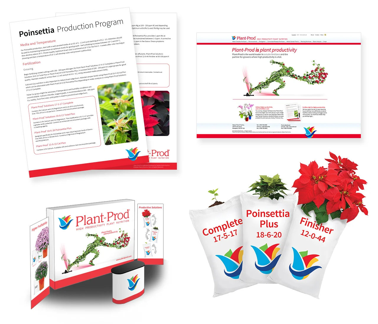
Plant-Prod is a the leading soluable fertilizer producer in North America. Their brand had multiple problems, starting with the fact they used multiple logos, colours, and company names. Their brand also looked like their competitors’.
As the key designer, I removed their alias, Plantex, and unified all of their brands as Plant-Prod. The logo was redesigned with multiple colours to stand out amongst the sea of green competing logos. A new key image, "The Runner", was created to reflect their products’ effectiveness.
Our Future Without AIDS is the annual fund raiser for CANFAR, the Canadian Foundation for AIDS Research. For 2012, I created the entire brand for the event, including print and web advertisement, event signage, catalogues for the fund raiser's art auction and raffle ballots. CANFAR was looking for more than just red for the event, so a variety of colour was added to the palette.
Within a short time frame, 20 large scale posters were created, along with a 60 page art auction catalogue, as well as multiple web advertisements. The event was a great success and I have been asked to continue creating graphics for the CANFAR Young Professional Council.
Ice River Springs is an enviromentally concious bottled water producer. As a growing Canadian company of 20 years, they have gone through a number of rebrands to the current one we developed for them and created complete system of graphics for all their products and promotions.
From the bottle label design to trade show booths, I was the key design to create a whole host of unique items to design.
Fugawi is a marine navigation chart software company that has been in business for decades. As a studio designer, I rebranded their identity and brand focus as Fugawi: The Center for Marine Naviation. The logo and graphics are inspired by navigation points and charting diagrams, which we're applied to their brand, website, and product software and packaging.
Michelin Tires’ Fall 2011 promotion focused on Michelin X-Ice Xi2 Tires. A print advertisement had been created by Michelin and was to be made into an animated Flash advertisement. It was to be displayed in Active Green + Ross Complete Tire & Auto Centre.
ThruPut Manager is a software product created by MVS Solutions Inc. to manage workload on high–end mainframes. The goal was to create an identity and flash presentation with animated diagrams for seminars and meetings that would explain the uses of ThruPut Manager. Actionscript 2.0 was used to allow control through either mouse or keyboard.
The key graphic in this project is the bar chart, which shows how ThruPut Manager prioritizes the data it needs to process. Work, or “jobs”, are represented as punch cards, colour-coded by level of importance. The bar chart indicates the job’s importance level as it waits to be processed.
The new brand I created relates to ThruPut Manager’s main function: to process the most important work and the most amount of work in the least amount of time. Italic sans-serifs and clock hands reflect the speed of the software.
This is a Canadian wine festival with international renown. It is an annual fund-raiser for the Playhouse Theatre Company. Each year is given a signature theme. The 2007 theme was Australian Wine: A World of Difference.
The goal was to create a bilingual poster and ticket for the festival for the target audience. Based on the 2007 theme, wine related objects project the shadow of a kangaroo to tie these attributes together.
Welcome to Era. This is a favourite school project of mine and one of my earliest experiences in branding. The goal of this project was to create a corporate identity for a fictional business. Era is a high-technatural history museum.
The name reflects the physical layout of the exhibits. Era is an underground structure with several levels, where each level is dedicated to a particular time period. The time periods, or eras, begin with present day life at the top level and end with the oldest at the bottom level. The identity reflects the interior layout of the building.